Sometimes the smallest changes make the biggest difference.
Not long ago, I reviewed a website that had beautiful animations, modern layouts, and impressive visuals.
But there was one problem.
Visitors didn’t know what to do next.
The solution wasn’t another animation.
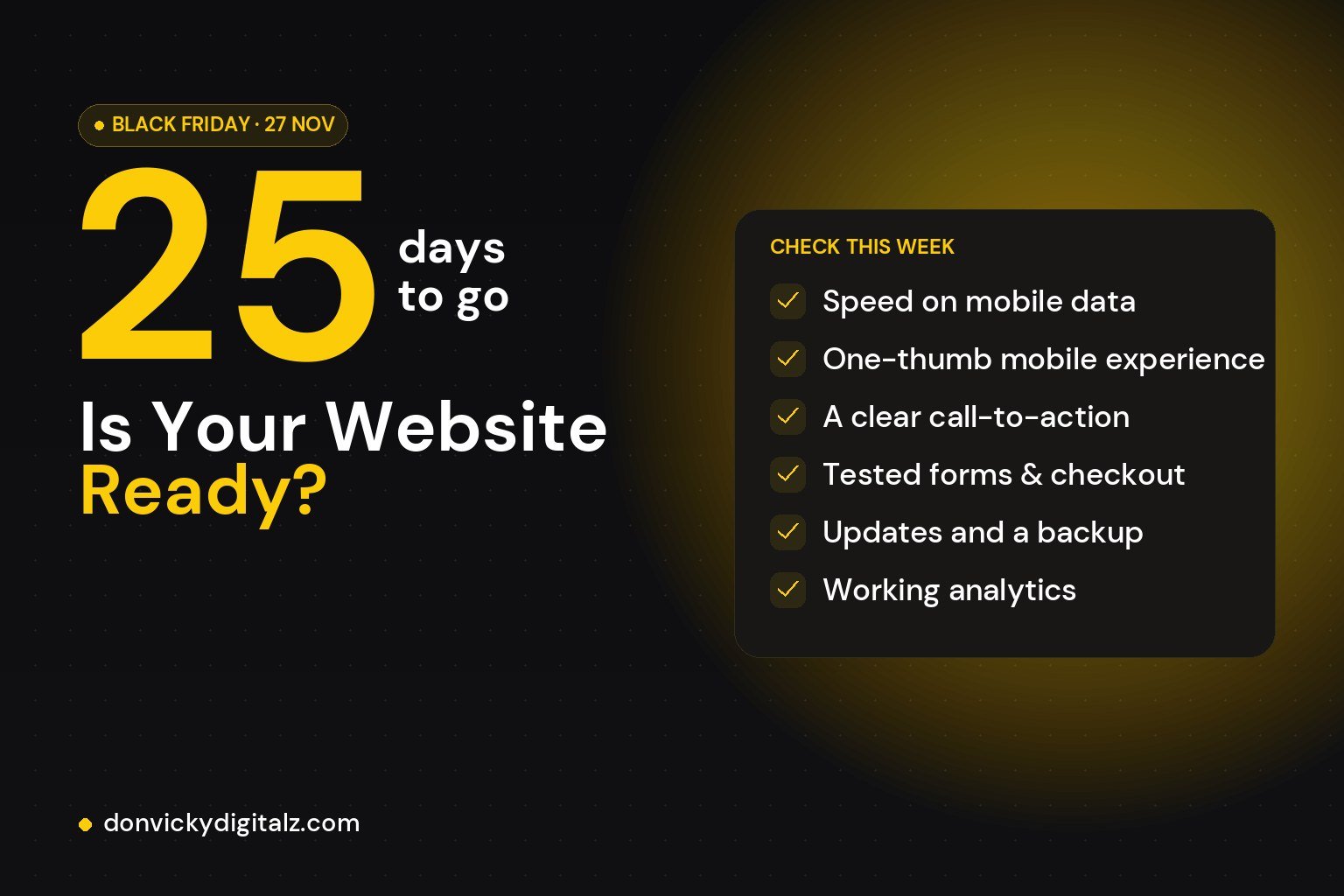
It was a clearer call-to-action.
A button that simply answered the question:
“𝗪𝗵𝗮𝘁’𝘀 𝗺𝘆 𝗻𝗲𝘅𝘁 𝘀𝘁𝗲𝗽?”
Good design isn’t about adding more.
It’s about removing confusion.
Every button should have a purpose.
Every page should guide a decision.
Every visitor should know where to go next.
That’s how great websites work.
𝗪𝗵𝗮𝘁’𝘀 𝘁𝗵𝗲 𝗯𝗲𝘀𝘁 𝗰𝗮𝗹𝗹-𝘁𝗼-𝗮𝗰𝘁𝗶𝗼𝗻 𝘆𝗼𝘂’𝘃𝗲 𝘀𝗲𝗲𝗻 𝗼𝗻 𝗮 𝘄𝗲𝗯𝘀𝗶𝘁𝗲 𝗿𝗲𝗰𝗲𝗻𝘁𝗹𝘆?